Designing a premium e-commerce system that increases conversion without compromising brand trust
TL;DR
EGO Movement, a Swiss premium e-bike brand, needed its digital experience to match its product craftsmanship while driving measurable growth.
Over 8 months, I led UX research, information architecture redesign, and critical conversion flows across browsing, test drive booking, and checkout.
By diagnosing navigation breakdowns, prioritizing high-leverage user journeys, and introducing transparent pricing and privacy-safe recommendation systems, the redesign improved clarity, increased conversions by 45%, and enabled 72% successful purchase completion.

Team
2 Product Manager
1 UX Lead
1 UX Designer
2 UI Designer

Tools Used
Figma, Axure RP, Microsoft Office 365

Team
10 months (April ‘23 - Feb ‘24)
Impact
The redesign generated measurable and modelled improvements.
Context
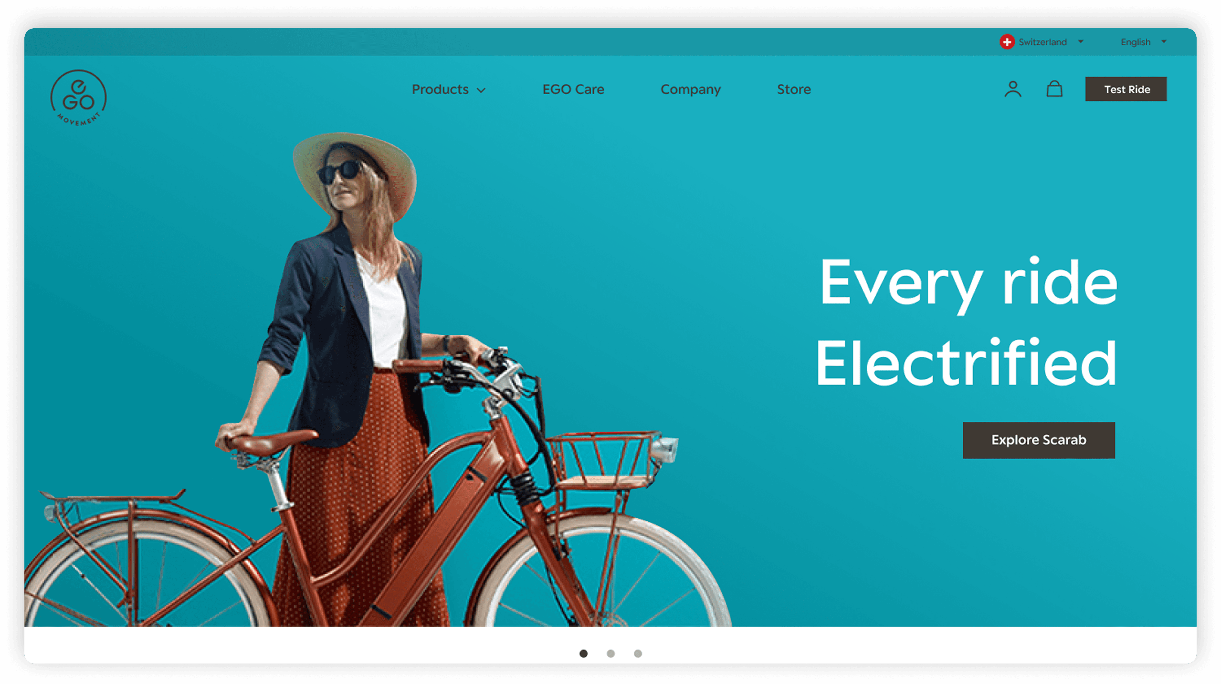
EGO Movement builds premium urban e-bikes rooted in sustainability and minimalist design. Their products are high-consideration purchases- customers compare carefully, evaluate financing, and seek reassurance before committing.
When I joined, the website reflected strong aesthetics but lacked structured support for decision-making. The business goals were clear but the challenge was to balance storytelling with performance-driven commerce.
Business Goals
Reflect premium brand identity
Improve lifestyle-based discovery
Increase cart value
Improve conversion rates
Problem Space
Despite strong brand perception and premium product quality, EGO Movement’s digital experience was not effectively converting interest into action. The website introduced friction during product exploration and checkout which created uncertainty in a high-consideration purchase journey. Some specific issues were:


Problem Statement
How might we redesign EGO Movement’s e-commerce experience to reduce decision friction, increase transparency, and guide users confidently from discovery to purchase without compromising its premium positioning?
Design Highlights
Rather than redesigning everything at once, I focused on the parts of the experience that most directly influenced trust and conversion.
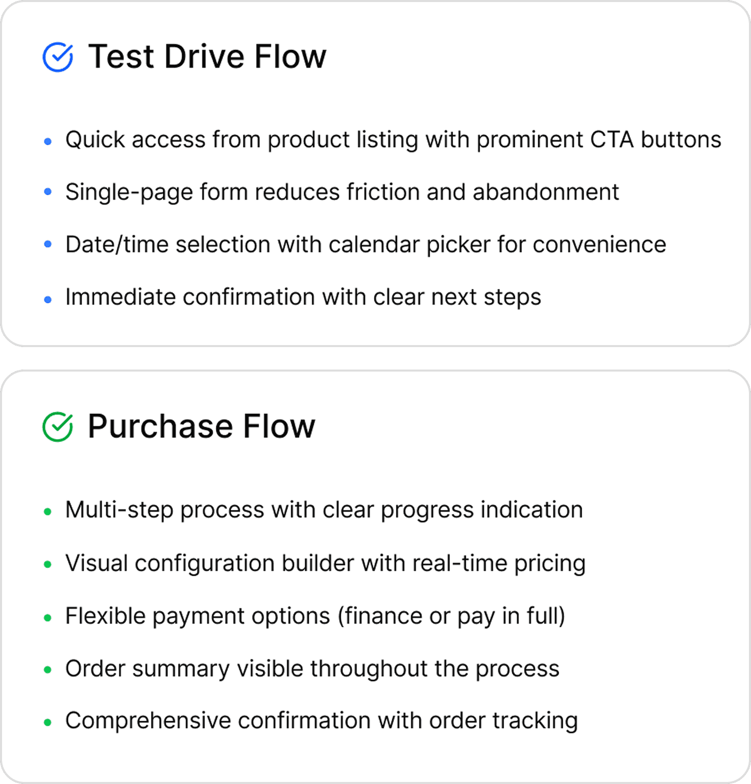
Flow Prioritization Based on Business Impact
Given timeline constraints, I focused on two high-impact flows as they represented the strongest conversion opportunities and allowed measurable improvement within scope.
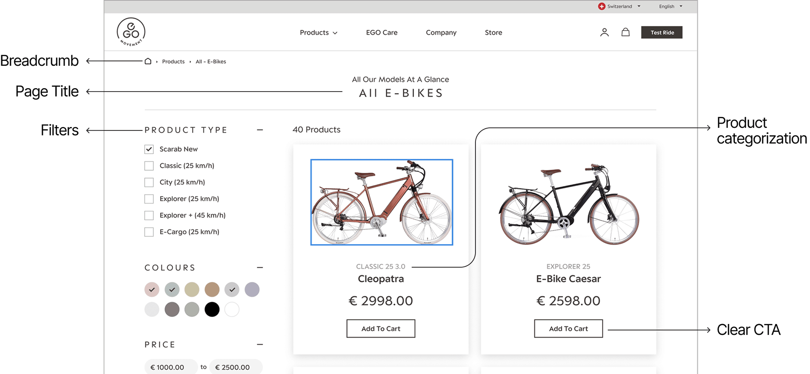
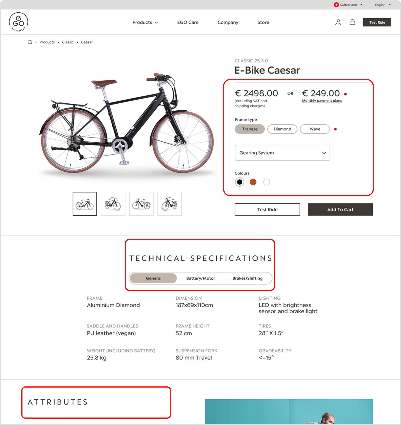
Product Detail Page Restructure
Research indicated that navigation ambiguity reduced confidence and slowed product exploration. I restructured the IA to introduce a clearer hierarchy, lifestyle categorization, and intent-driven pathways.
Desktop-First Strategy
Analytics revealed that high-value purchases were predominantly completed on desktop, so we adopted a desktop-first approach to support deeper evaluation and structured comparison.
Progressive Checkout Design
Interviews showed that checkout anxiety stemmed from unclear effort and lack of progress visibility. I introduced progressive disclosure with step indicators and focused microcopy to reduce abandonment.
GDPR-Compliant Recommendations
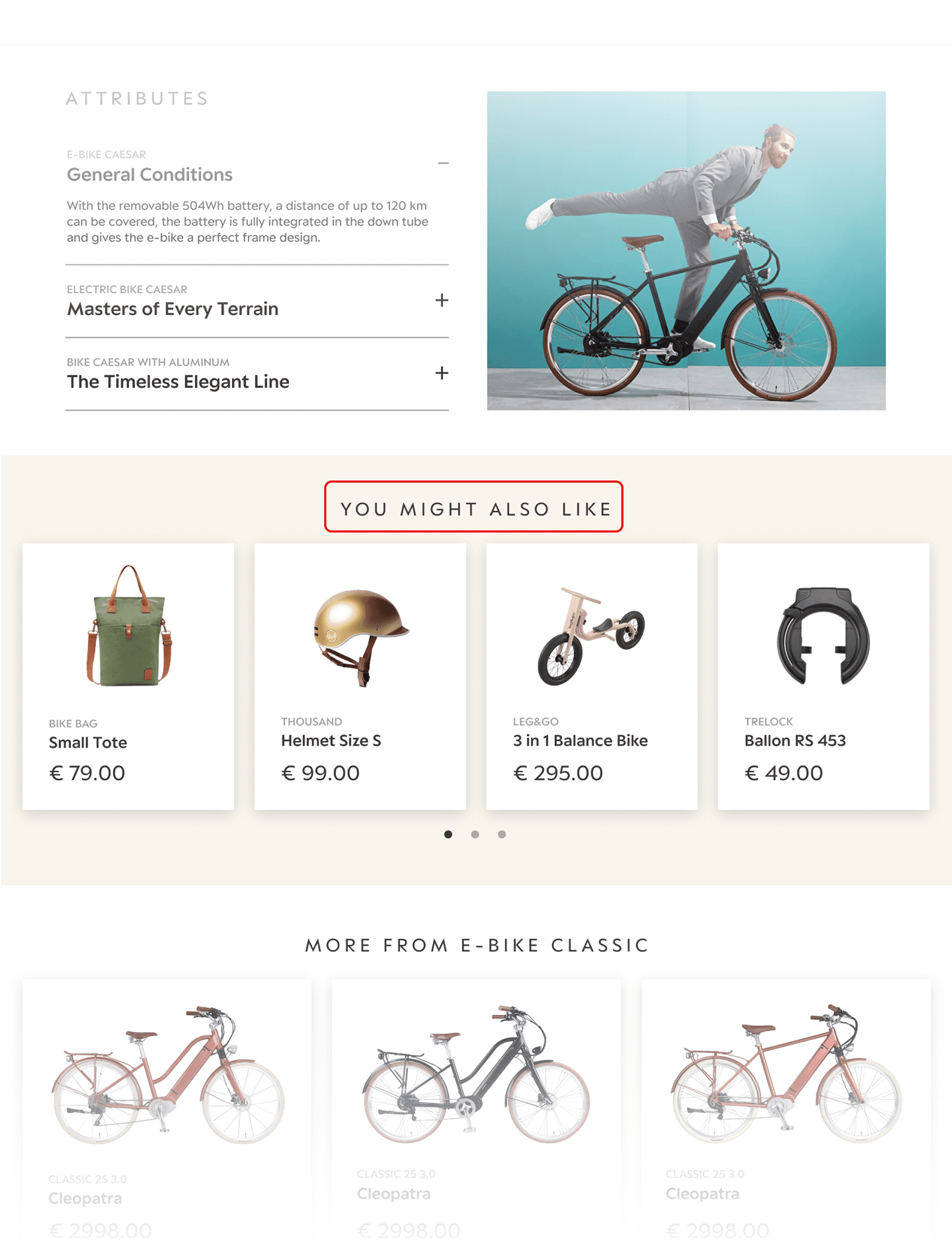
To increase cart value while complying with GDPR restrictions on behavioral tracking, I implemented aggregated “Frequently Purchased Together” recommendations that preserved user privacy while still enabling effective cross-sell.
Research Overview
I set out to diagnose where hesitation occurred in the high-consideration purchase journey and determine whether friction stemmed from brand perception, navigation structure, or checkout uncertainty.
Rather than assuming that a visual redesign was needed, I structured the research to isolate structural vs. behavioral breakdowns.
Research Strategy
To answer our questions, I led a focused, layered approach where each method tested a specific assumption.


Key Insights
Tradeoffs
Throughout the redesign, I navigated tradeoffs between ambition, brand positioning, and system limitations to prioritize measurable outcomes.

Transparency vs. Premium Positioning
Despite initial hesitation around surfacing EMI financing, research showed that pricing clarity reduced hesitation. Introducing EMI visibility directly on product pages resulted in a 45% increase in conversions.
Designing Within Technical Constraints
Magnolia CMS limited search tuning and personalization. I prioritized stronger filtering, synonym mapping, and clear hierarchy to improve findability without increasing technical complexity.
Focus Over Feature Expansion
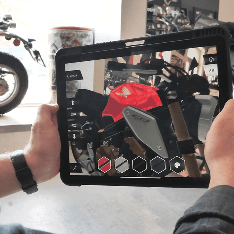
While immersive features (AR/360) were explored, research revealed structural friction in evaluation and checkout. We prioritized optimizing high-impact conversion flows over expanding experiential features.
Reflection
This project reinforced that strong product design sits at the intersection of clarity, alignment, and execution.

I learned that effective UX requires translating between users, business stakeholders, and developers. Design impact depends as much on cross-functional alignment as it does on interface quality.

Balancing stakeholder ambition, technical constraints, and user needs required continuous adjustment. Strong design isn’t rigid, it evolves through feedback and context.

Clear articulation from client presentations to developer handoffs was essential to turning strategy into shipped outcomes. Vision only matters if it can be operationalized.